Correct Logo Usage
Your logo is one of the most important elements of your brand. Using it consistently — and correctly — ensures your business looks polished and professional across all platforms.
✅ Acceptable Uses
- Full-color logo on light or neutral backgrounds
- White version on dark backgrounds
- Black version on light backgrounds
- Logo used with appropriate padding/space around it
- Scaling without distortion (keep proportions locked)
❌ Things to Avoid
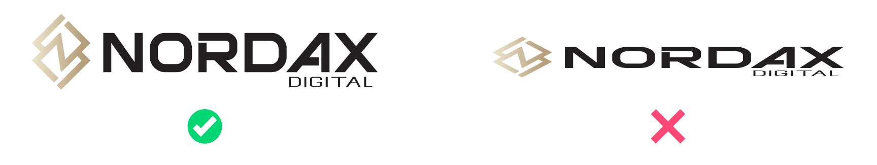
1. Stretching or Distorting
Never squash, stretch, or rotate the logo.
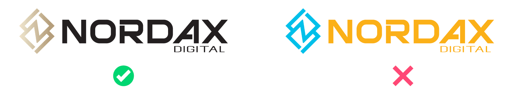
2. Changing Colors
Stick to the approved color versions — full color, black, or white only.
3. Adding Effects
Avoid shadows, bevels, glows, or outlines unless specifically designed that way.

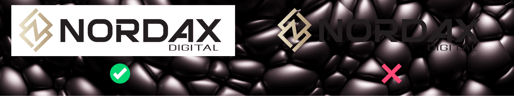
4. Placing on Busy Backgrounds
Keep the logo readable and clean. Avoid placing it over photos or textures without proper contrast or a container.
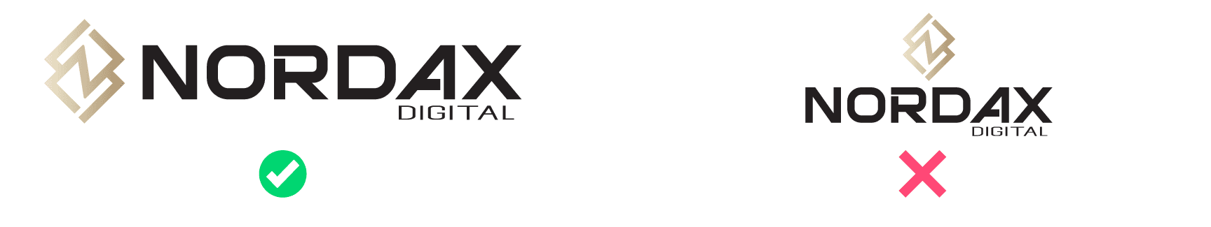
5. Modifying the Layout
Don’t rearrange or separate parts of the logo. Use the logo as a single unit.
Need a Custom Version?
We’ve got you. If you need a special version of your logo for embroidery, screen printing, or other one-off uses — just email support@nordaxdigital.com and we’ll create it for you.
If you ever feel unsure — send us a screenshot or link. We’ll quickly confirm what’s correct.